
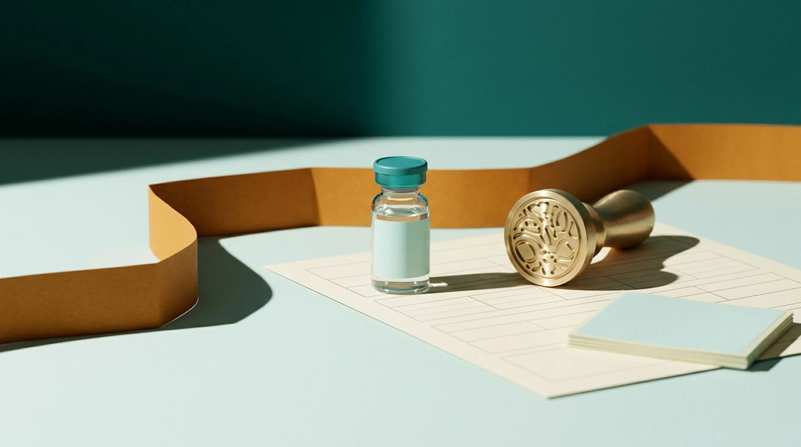
If you hand a designer the words "scientific, clean, maybe a helix" and expect one logo to suit every audience, you will get artwork that fails on the vial. Write the brief around your business model first, because a research-use-only supplier and a clinic or telehealth brand need different visual and messaging boundaries.
Our view at Peptide Marketing HQ is that a peptide logo for a research-use-only brand is a working part of a label system, not a standalone graphic. It gets tested on a 3 ml vial label, a COA header and a favicon. It ships in one-color versions, stays clear of medical and pharma look-alike symbols, and gets a trademark search before anything is printed. Every section below supports that view.
What a peptide logo has to survive
A peptide logo for a research-use-only brand is judged first on a 3 ml vial label, a COA header and a favicon. A pitch deck comes last. This post is about vial branding for research suppliers, not clinic or telehealth identities, although we cover where those differ.
In a normal week the mark shows up in four places:
- the vial label
- the carton
- the COA page
- the WooCommerce store, including product cards, the favicon, the email footer and the social avatar
A mark that only looks good large has failed three of those four.
The logo is also a review artifact. FDA's intended-use rule, 21 CFR 201.128, says a product's intended use is judged from objective evidence. That evidence includes labeling, advertising, written statements and the circumstances of distribution.
A "research use only" line is one piece of that evidence, not a switch that ends the analysis. So every element of the mark counts as evidence. A syringe in the symbol, a human silhouette or a name that implies a result points to human use, whatever the footer says.
To see how the agency applies the rule, search FDA's warning letters database for "research use only". Open the letters addressed to peptide sellers and read where they quote the seller's own product names, images and site copy.
We do not reproduce individual letters here, because each one should be read in full, with its date. Then check your own mark against what the agency quotes.
Payment reviewers work differently, and a logo changes less there than founders hope. Stripe and PayPal publish restricted-business policies that turn on what is sold and how it is described. Decline notices rarely say which element triggered the decision, so we do not claim a logo alone ever caused one.
What a logo can do is add to a problem. A clinic-style icon beside research-use wording gives a reviewer a reason to read the rest of the site as human-use. What a logo cannot do is move your products into a category the policy does not allow.
We treat the logo, the product names and the photography as one package a reviewer sees at once.
Different brands, different boundaries
- Research supplier: technical and credible. No imagery or wording that suggests treatment, dosing, injection or outcomes.
- Compounding pharmacy partner: the identity must make the pharmacy and brand roles clear. It must never imply the brand is the compounder when it is not.
- Clinic or telehealth brand: the identity supports a real provider relationship, with transparent prescriber and pharmacy roles and advertising review.
Our boundary is plain. We design identity for research suppliers and, separately, for clinics and telehealth brands, each within its own rules. We never use branding to disguise intended use or to dodge a processor.
Make your peptide logo legible at small sizes
A 3 ml vial gives you very little room. The glass is curved, the print area is narrow, and the mark shares space with the product name, strength and lot fields. Give the logo a fixed corner of the label. It should not get whatever space is left after the data is placed.

Build two files, not one
Make a compact mark and a full wordmark as separate files. The compact mark (a monogram or simple symbol) goes on the vial cap area, the favicon and the social avatar. The full wordmark goes on the carton, the COA header and the website header.
Test both the same way. Print the label at actual size on a plain office printer, hold it at arm's length and read it. If you squint, the mark has failed.
Check strokes, spacing and counters
Thin hairlines and tight letter spacing close up when printed small or on matte label stock. Counters, the enclosed spaces in letters like "e" and "a", fill with ink and turn into dots. Favor sturdy letterforms with open spacing, and write a minimum-size rule into the brand sheet in millimeters.
A minimum-size rule is a sentence on a page, but it stops a printer or a rushed team member from shrinking the mark below the point where it reads.
Run the favicon and COA tests
Reduce the mark to a 32 px square and look at it in a browser tab. Then place the wordmark at the top of a letter-size COA page, above dense data tables. A good header mark stays quiet and sharp there. It should not fight the data for attention.
Does your logo work in one color?
It has to, and you should design it in one color first. Thermal and single-ink label printers, monochrome invoices and photocopied COAs all strip the color out. If the mark only works in a gradient, it will look broken on most of the paper your customers actually handle.
Start in black. Add color only after the black version holds up on its own, and treat the color version as a bonus.
Contrast on glass is the next trap. A pale mark can vanish on amber, tinted or frosted vials, and a white-out version needs a dark enough label or backing behind it. Order a small test run, stick the labels on real vials and look at them under normal room light and a window. Do this before any full print run.
Put these four items in your designer brief, because they are the ones a vial adds:
- A one-color lockup that sits beside the product name and lot fields.
- A minimum size in millimeters for the 3 ml label, for both the compact mark and the wordmark.
- A white-out version for amber glass, with the backing it needs.
- A COA-header version that stays quiet above dense data tables.
Skip look-alike pharma and medical marks
Avoid syringes, medical crosses, caduceus-style symbols, prescription-pad shapes and anything that reads as a pharmacy or an approved drug. These work as human-use signals whatever disclaimer sits underneath. A reviewer does not need to read your terms page to form that impression.

Generic molecule and DNA helix icons are a different problem, and a vague brief ("scientific, clean, maybe a helix") is how a designer ends up drawing one. Test it yourself.
Search the USPTO trademark database and the first page of any peptide marketplace for helix marks, then count how many you could tell apart at 10 mm. They are also weak trademarks. US trademark law ranks marks from generic and descriptive up to suggestive, arbitrary and fanciful.
Under Section 2(e)(1) of the Trademark Act, an examiner can refuse a mark that merely describes the goods, and a helix on a peptide label depicts the goods. At best the examiner requires a disclaimer of the design element, as the TMEP explains.
Descriptive marks get narrow protection or none, so a competitor can use a near-identical helix and you will struggle to object. Try a distinctive wordmark, a monogram or a simple geometric mark instead.
A red-flag checklist for logo, label and copy
The logo is only one of the things a reviewer reads. Flag any of these across your system:
- a logo or icon that suggests injection, treatment or a clinic
- product photography that shows a vial next to a syringe or a person
- dosage references, or a peptide calculator on the site
- testimonials of any kind
- wording that implies weight loss, clinical outcomes or FDA approval
- a name that sounds like a drug brand or a pharmacy
Our compliance review reads logo, label and copy together for this reason. We do not recommend printing "Not for Human Consumption" as a shield. It is a negative hedge, and to a reviewer it reads as a seller who knows people might use the product that way.
Say what the product is for instead. A line such as "For laboratory research use only", followed by your company name, the lot number and the COA reference, states the intended customer and points to a traceable record.
That combination reads as a lab supplier's paperwork, and it only holds if the rest of the system agrees with it. Our earlier post on what belongs on a peptide vial label covers the full label text.
Run a trademark search before you print
This is the step that gets skipped. Reprinting labels and cartons, then rebuilding a store after a conflict, costs far more than a search does. We are not lawyers, and this is not legal advice.
Here is a sensible order of operations:
- Run a knockout search of the name and the mark in a general search engine and on marketplaces.
- Search the USPTO trademark database for similar marks in the relevant classes.
- Check the domain and the social handles you will need.
- Book a call with a trademark attorney and bring your findings.
Conflicts to expect in this niche
Start with the classes. Under the USPTO's Nice-based system, chemical preparations for scientific use fall in Class 1, pharmaceutical preparations in Class 5, and online retail store services in Class 35. Search all three, plus Class 44 for medical services. Examiners can cite a Class 5 mark against a Class 1 filing when the goods are related, so a compounding pharmacy's name can block a research supplier.
Now look at the stems. "Pep", "bio", "lab" and "amino" are descriptive or highly suggestive for peptide goods, so an examiner may require you to disclaim them. They also give you almost no protection of your own.
Once those stems are set aside, the comparison falls on whatever is left, and that is where collisions happen. Run the sound-alike test directly. Say your name aloud beside every candidate in the database, strip the shared stems, and compare what remains.
If the remainder differs by one letter, or shares a common ending, treat it as a conflict. An examiner compares sound, meaning and appearance, and a pair can fail on sound alone. Check clinic and pharmacy marks too. A conflict with one of them is more likely to draw attention.
Set the timing
Finish the search before final artwork and before a bulk label order. Sign off the brand file once, after the search is done. Changing a name after the labels are printed means paying for the same work twice.
The label system keeps artwork fixed and fields variable
Build the label as a master template. The logo, brand colors and layout stay locked. Product name, quantity or strength, lot number, date and batch or COA reference change by SKU. Most designers hand over a logo and stop there, which leaves the founder rebuilding each label by hand.
The same system should carry over to every touchpoint. Each of these uses the same mark, colors and wording rules:
- the carton
- the COA header
- the WooCommerce theme and product cards
- the email footer
- the social avatar
If you print UPC barcodes, the numbers come from a GS1 US company prefix. Keep a reserved space for them in the template so they never crowd the mark.
Consistency also helps compliance review. A reviewer who sees the same careful identity and plain wording on the vial, the COA and the site gets a clearer picture of a real research supplier. Mismatched fonts, a clinic-style icon on the site and a lab-style label on the vial tell the opposite story.
Our label design work is at peptide label and packaging design. If you want to lay out a quick template first, try the free peptide label maker before you commit to custom artwork. This week, print your current label at actual size, hold it at arm's length and read it.
Then convert the mark to black only and check that it still holds. If either test fails, fix the mark before the next print run.
If you would like us to check your label and logo against the red-flag checklist above, ask for a free store audit and send them with your request. We will send back notes.
Frequently asked questions
What makes a good peptide logo for a research-use-only brand?
It reads clearly on a small vial label, a COA header and a favicon. It works in one color, avoids medical and pharma symbols, and has been searched for trademark conflicts. It should look technical and credible without suggesting treatment or clinical outcomes.
What files should a designer deliver with a peptide logo?
Ask for the items a vial adds. That means a one-color lockup, a minimum size in millimeters for a 3 ml label, a white-out version for amber glass and a COA-header version. Standard exports and source files come with any competent logo job.
Should I use a DNA helix, molecule or syringe in my peptide logo?
We advise against it. Syringes and medical symbols read as human-use signals. Helix and molecule icons describe the goods, so they are hard to protect and easy to confuse with other brands. A distinctive wordmark, monogram or geometric mark is safer and easier to own.
Can a logo fix a payment processor or advertising problem?
No. Branding can make your business clearer and more credible, but it does not override underwriting, platform rules or the law. We never design branding to hide intended use or evade a processor.
When should I do a trademark search?
Do it before final artwork and before any bulk label order. A knockout search, a USPTO database check, a domain and handle check and a call with a trademark attorney is a sensible order. We are not lawyers, so treat this as a process outline and not legal advice.
